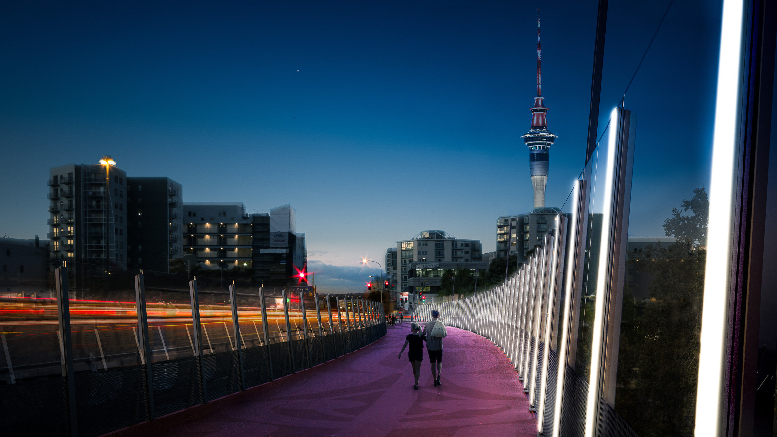
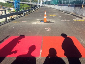
Red-hot news, or should we say, hot-pink news! The first official images of the Nelson St design have been released. Remember that the public consultation resulted in two strong directives: “modern” and “distinctly New Zealand.” And as you can see from the images released today, the colour – disco pink? fuchsia? magenta! – is unashamedly modern, brilliantly artificial. It’s certainly eye-catching. From afar, it will act as a beacon, drawing the eye like a streak of neon highlighter through the otherwise dull text of Spaghetti Junction…
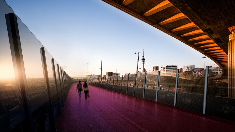
Does it scream Aotearoa, though? It’s certainly not featured on any of the would-be flag finalists. But artist Katz Maihi of Toitu Design and Te Puia (the NZ Maori Arts and Crafts institute), who created the surface design and carvings – in consultation with mana whenua, and design experts Dean MacKenzie and Hamish Monk from Monk Mackenzie and Henry Crothers from LandLAB – says that when the colour was unveiled, he was instantly drawn to it, recognised its organic quality, and knew exactly how it would tie in to a creative story.
“I love it, I actually love it. Immediately I knew what I was going to reference it to. We use the totara tree to carve all of our meeting houses and canoes. If you’ve carved, you know this colour – the heartwood is pink, red, orange, and brown. It’s a colour that comes from the land.”
The intensified magenta provides a brilliant contrast not only with the greys of the surrounding motorway, but also the deep greens of the native forest below and and around Spaghetti Junction, so ubiquitous as to be invisible until thrown into relief. And, amongst the steel and perspex, Katz’s organic forms remind us who first walked the hills and valleys of this place.
But above all, as Katz points out, the land came first. And that was a crucial part of his discussions with the many iwi of Tamaki Makaurau, the city of a thousand lovers.
“I can whakapapa to pretty much all the Auckland iwi. So I said, what if we remove our ‘iwi egos’ and see what is left if we remove our stories from this place. What came out of that conversation is that we all realised that the land was there before all of us. The whole theme became about whenua, and acknowledgement to that land… because that land has divided us over the centuries, but it’s also given us shelter, it’s given us shade, it’s given us food, and it’s given us mana.”
Like many of us, Katz had first assumed that the Spaghetti Junction canyon was always that shape. “I’d assumed it was a natural valley, like Grafton … but no, man came in and pushed land around and built himself a little castle. I was shocked and even a little hurt to realise the extent of it. But no matter what we do to it, the land will be here after we’re gone. Whatungarongaro te tangata, toitu te whenua – people come and go, but the land remains.”
Along the ramp, too, the people symbolically come and go: etched steel carvings of humanistic figures will stand on the uprights at intervals along the length of the promenade, evoking the many different cultures who call Auckland home. Says Katz, “There are so many different nations in our land now, so the design acknowledges inclusiveness, without attaching names to different nations or iwi. Although it’s done in Maori design, it includes everyone.”
And, painted on the surface, a symmetrical kowhaiwhai pattern appears at each end as the pink colouring slowly trades weight with the black tarmac. This, too, represents a dialogue between nature and technology, between the land and our human attempts to shape it, explains Katz. “These organic shapes come from the land; they’re our human attempt at trying to acknowledge nature, which has its own processes of creation, and its own beauty. We’ve been trying to figure out for years how to make things, but we just have to follow the processes nature has given us.”
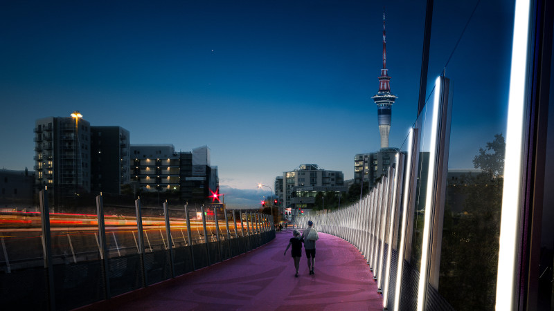
At the city end, a dramatic 6-metre pou whenua with a laser-cut motif will mark your emergence into a different space. It acts as dramatic punctuation to the journey: You Are Here. Backlit by the setting sun, it will be even more powerful.
Of course, when you build something like the Nelson St project, there’s always one thing missing in the construction process. One element you can’t predict. People. As discovered by the creators of New York’s High Line – and the recently reopened High Bridge – if you build it they will definitely come… but you can’t tell what they’ll do with the space until they do it.
So how will people use Nelson St? Will it be, like the High Line, “a runway where people go to see and to be seen, like a return to the 19th-century promenade”? Or simply a diverting diversion for bikes? Or some combination of the two? Well, it depends on how and when they arrive.
The path links the back side (ahem) of Karangahape Rd to the top end of Nelson St, and is traversable in either direction, but has clearly been designed with a story in mind. If you’re walking or biking it for fun, it will make most sense to enter from the Upper Queen St end, and make your way down the steadily widening path to meet the sudden full-scale panorama of harbour and city.
That way, you begin with a subtle and unexpectedly low-key entrance in a slightly scruffy corner of town… although we won’t be surprised to see that parking space at the bottom of Canada St transformed into a night-market or some other pop-up excitement, and the eventual construction of the CRL Karangahape station will enliven this area even further.
For now, though, you’ll travel along the freshly poured concrete path alongside the motorway, ducking through what will eventually be a green tunnel of trees, and then move up onto the sinuous Canada St bridge, over the motorway canyon beside the K Rd crib wall, emerging into the middle of Spaghetti Junction.
As you move along, the buff-coloured surface of that first section will metamorphose into a dramatic glow under your feet (or your wheels). In daylight, the journey will be all about the views – the unfolding confrontation with the dramatic bundle of roading all around, and the unexpected angles on a familiar city glimpsed and enjoyed at walking or biking pace. And yes, there will be seating, for those who wish to pause: steel, like a folded staple… high gloss pink on pink, as if emerging from the surface itself.
At night, it will become something else altogether. Guaranteed, the romantic thing will be to walk the bridge just as night falls – that way you’ll catch the sunset, as so often photographed from the Hopetoun Bridge… the sky flaming overhead as if reflecting the hot pink surface under your feet.
And then there’s the lighting. All the way down the eastern side of the bridge, the steel uprights will glow and pulse with bars of light. So the foreshortening effect of the steel framework, which in daylight produces from certain angles a wedge of darkness, will become instead a corrugated ripple of colour.
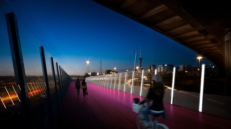
Dean MacKenzie from Monk MacKenzie describes the process that led to the lighting scheme. “There are two distinct sides to this space – the harbour side, with the view of the Harbour Bridge, and the city side. We wanted an asymmetrical feeling. The light poles are 20m apart, and we put them all on the eastern side so you create a sort of spine. Then, instead of thinking of the throw screens and barriers and trying to pretend they’re not there, we thought: what if we used the posts as an idea in their own right? What if the throw screens became an infrastructure for a lighting idea?”
Putting the scale of the lighting design into perspective: the offramp section is 700m long, which is twice the height of Sky Tower. As Dean explains, “The original geometry of the road is about cars and speed – but when you put the lights on, it spells out the new function of the space.” Best of all, the LED lights can project any shade, and can be automated (there’s talk of handing this over to a series of digital artists). Imagine them set to light up as people pass by! Or brought to life with music, programmed to dance in sequence.
Did somebody say sequins? Hmm. Synchronised lights playing against the vermilion-painted road surface… and there is something ferociously camp and sexy about the colour choice. Some might imagine the path as a big juicy kiss: a glam and glossy schmear of lipstick, joining K Rd to the waterfront and the famous red fence where WW2 dalliances took place (hello, sailor!).
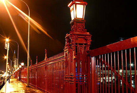
But whatever associations this gorgeous thing sparks, it’s absolutely going to develop a personality – and it’s going to need a name.
“Sky Trench” was a cutesy early putdown… but it won’t fly any more. “The Flyover” has potential, evoking the birds that dart through urban canyons, but is it perhaps too anonymous?
“SkyPath” is already taken, of course, but would have been quite apt: after all, this space is elevated, like the High Line; and like the High Line, it will attract crowds (5 million a year in NYC – how many here?), and will bring coffee shops and food joints and people-watching and life to what was once a severe, arid part of town. (Quick, somebody buy the Higher Thought Temple and turn it into a cafe/bar!)
If the surface were blue, you might call it “SkyRiver”, an aqueduct of people – or a “bikequeduct”, as writer Sam Finnemore suggested! – but alas, it’s not blue. And, despite the glimpses of motorway native forest, it’s not green either, so no SkyGarden.
Or, you might look at the mineral surfeit around you, and the brilliant surface below – a sizzling crimson, glowing by day and by night as it pours down into the city… and you might gaze around you at the city skyline punctuated by the maunga that made this place we live in… and you might think of Katz’s words about nature’s own powerful creative processes…
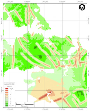
…and you might ask yourself: is this our “Lava Lane”?
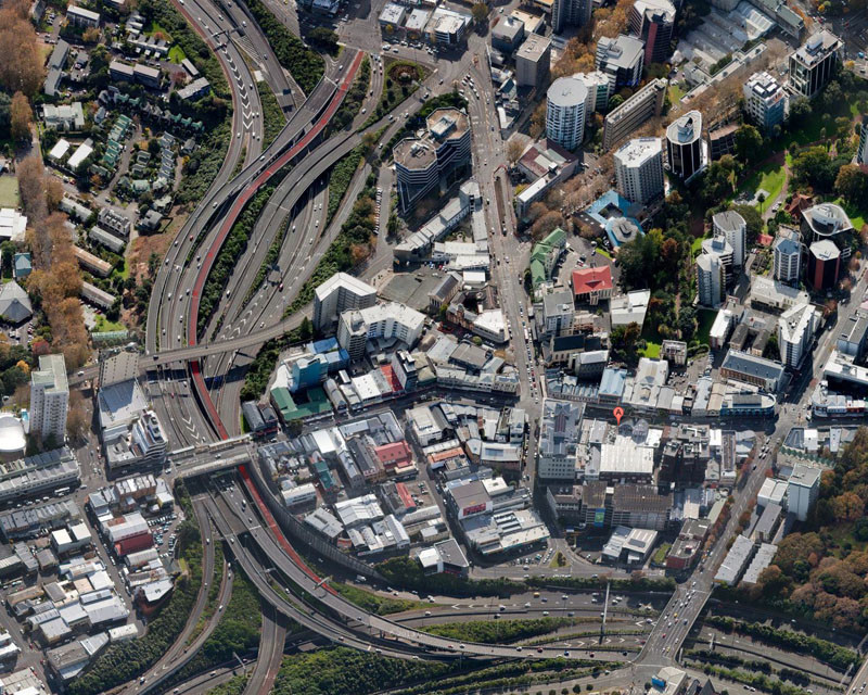
One guarantee: as the sun goes down you’ll definitely want to canoodle on this lovers’ lane.
Which brings us to perhaps the catchiest suggestion we’ve seen so far, from Greg Wood: in the midst of Spaghetti Junction, just for us, is… “The Noodle”?
(Turns out, the notion of Noodle Park has been floating around for a few years – well spotted, that man!).
Who knows which name will catch on. But we know one thing for sure: whatever we come to call this glorious, amazing, romantic, inclusive work of art – we can’t wait to canoodle on it in the dark, noodle along it (on a Noodle, perhaps!), stand on it and pay witness to our hubris in carving a city up for cars, warm up the space with a flow of events and art and creativity, and just love the heck out of it.
Now take an imaginary stroll, and get ready to ride…

