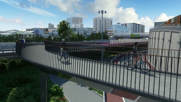
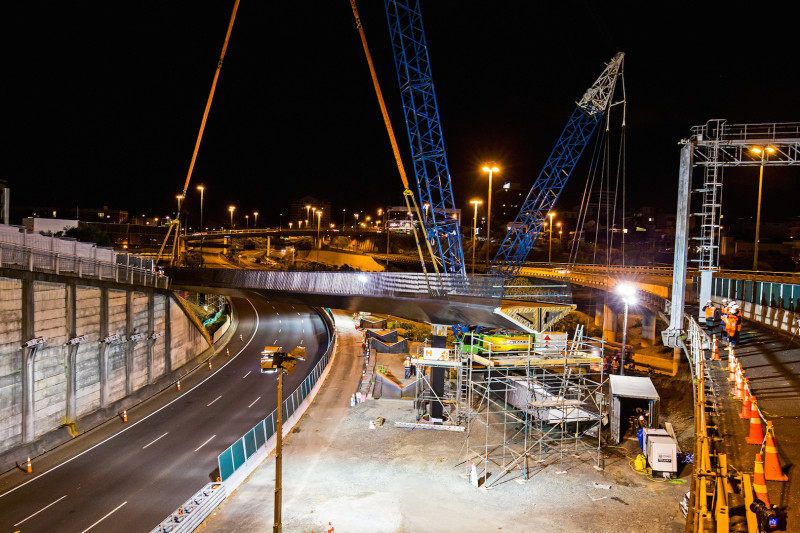
The last pieces of the Canada St bridge were slotted into place last night: a complete connection to the old Nelson St offramp, not much over a year since it was first dreamed up. And soon enough, we’ll be riding it! This stunning animation, just released, gives you a sense of what it will look and feel like.
(For more details about the colour and light design, by Monk McKenzie Architects and LandLAB with Toitu Design, check out our previous blog post).
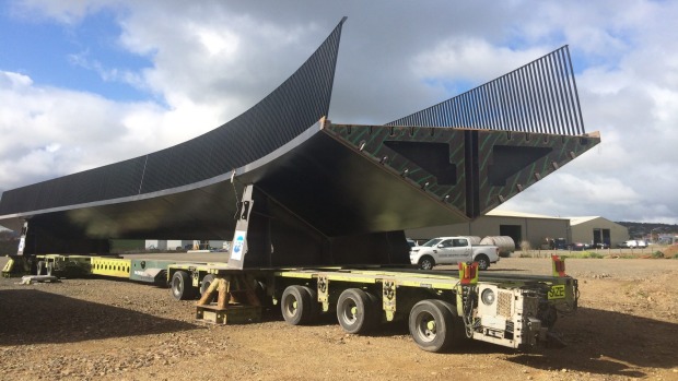
Those very first glimpses of the Canada St Bridge – which really does deserve a catchier name, doesn’t it? – were tantalising. There the sections sat, cradled on a truck for delivery, the shape so evocative… but of what?
Face-on, there was something a little foxy about that triangular cross-section, and yet…
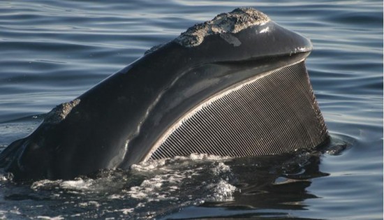
…those black steel ribs, like a slice of baleen – and the shiny black keel… a whale, perhaps?
…not a breaching whale, but a slim, levitating whale, like in this mysterious etching by 19th C French artist Charles Meryon, who visited Akaroa and thereafter dreamt of waka and chariots chasing whales through the skies of Paris.

Still, the curve and extent of the bridge suggests something longer than a whale: a slippery eel, perhaps, getting ready to travel overland as they are sometimes given to doing?
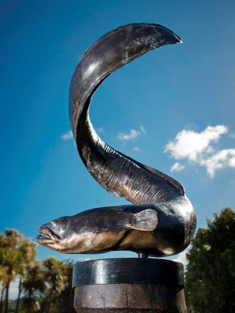
A dancing eel, like Patricia Grace’s Watercress Tuna, from further south…
We have the Hinaki (Eel Trap) bridge already, in Puketapapa… but is there space in our urban cosmology for an Eel Bridge? Te Tuna?
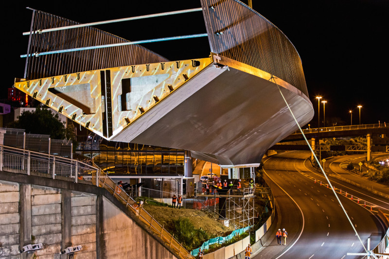
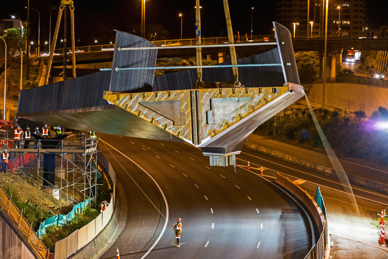
When the first section was swung into place one night in September, the shape of the bridge became clearer. Serpentine, sinuous, sleek, slinky. Here’s three photos of that first installation, courtesy of NZTA:
The thing is, it didn’t have to be quite so sleek and beautiful. The very first notion for a link to the old offramp imagined a Bailey Bridge from Karangahape Rd, and even when subsequent investigations shifted it from Day St to Canada St, it was always with a view to getting it done as a quick “pilot” project.
The final product is just one more example of how, even on a brutally tight timetable, everyone on this Nelson St transformation has surpassed themselves.
The Canada Street Bridge (what shall we call it?) is the proud work of engineers at Novare Design, with architectural input from Monk Mackenzie. It was fabricated by PFS in Hamilton and slotted into place by Hawkins. And it’s a finalist in the Infrastructure – Future Projects category of this year’s World Architecture Festival Awards being held in Singapore at the beginning of November.
All involved in the design agreed that the bridge had to be “buildable, erectable, transportable… and delightful,” said Duncan Peters of Novare. It also needed to be easily navigable by people on bikes: not too steep, and not too tightly curved.
The complicated location – spanning a busy stretch of State Highway 1 at the Central Motorway Junction and weaving its way down to Canada St – dictated the materials and design to a significant degree. Due to the tight site constraints, and a very limited timeframe for working over SH1, the largest section, 94 tonnes, had to be installed in one go. Therefore, the bridge had to be made from steel, which is a much lighter material than concrete.
And whereas most bridges are straight, this one describes a fairly strong series of curves in order to get around the site constraints while ensuring cyclists can travel smoothly. Myra Walton, Senior CAD Designer with Novare Design, worked over Christmas to finalise the alignment of the bridge from the pier close to South St all the way down to Canada St. It turns out there were only two possible options that didn’t a) breach the rules for the radii required for cyclists or b) get too close to nearby buildings. One of these was ruled out because it encroached over SH1 enough to be a potential distraction for drivers, so the other elegant swoop is what we now have.
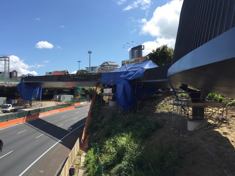
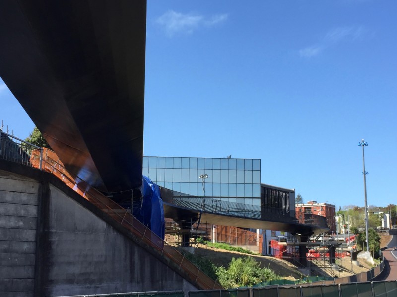
Making virtue out of necessity, the result is an optimised balance of form and function. As Andrew O’Connell from Novare says, “The bridge may look curved out of flamboyance, but in reality it simply has to be this way to make it all fit.” Here’s how it looked on October 7th, still draped in its work clothes and awaiting its last link to Canada St (pics by Andrew):
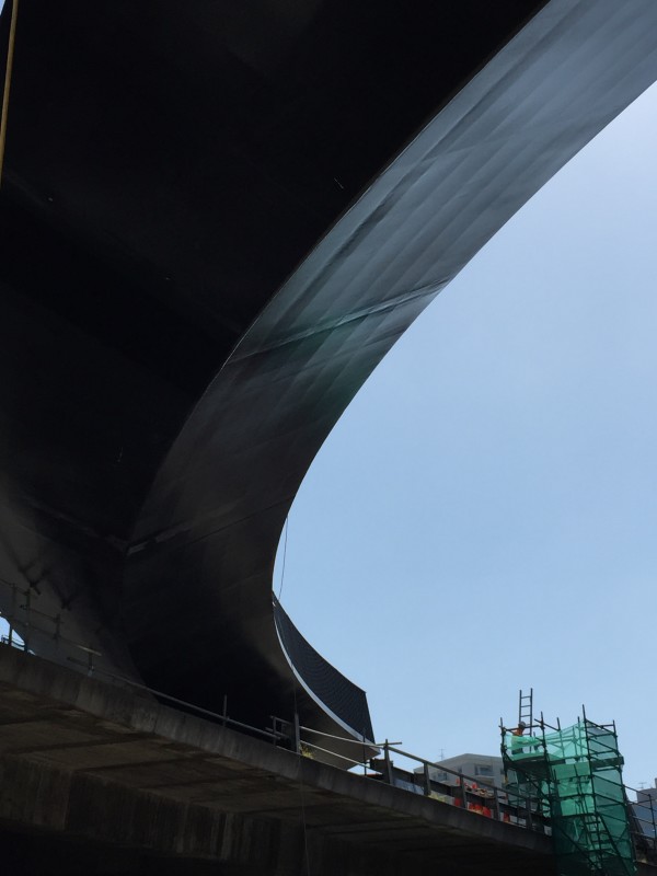
The curving geometry means the bridge has to deal with additional stresses in the form of torsion (not usually experienced by “regular” bridges). Hence the hollow structural form, which allows these torsional stresses to flow unobstructed around the skin of the bridge. Continuous interior ridges run along the inside of the steel skin to lend extra strength. Picture an outside-in piece of fusilli pasta, but triangular.
The hollow form was the best way to handle both the curvature and what’s described as the “possible eccentric live loading on the bridge deck” (that’s us they’re talking about, jiggling around). Andrew explains that the structure is known as “a steel orthotropic box girder.” The architect Dean MacKenzie elaborates via a more homely metaphor: “It’s a monocoque, like an egg: the skin of itself is what gives it its inherent structure.” And like an eggshell, it’s at once thin and strong, with a “skin of steel” only 12mm thick.
In cross-section, the bridge is triangular, which is very unusual (Andrew says there is one bridge in the Netherlands with a similar triangular deck, but that’s a suspension bridge – so you could say ours is unique). The triangle shape proved ideal in the design sense, given Dean’s wish to avoid a bluntly vertical fascia. Instead, he explains, “the sharp edges give you contrast between light and dark – and your eyes follow the line of the crease, like a blade. It’s sculptural and elegant.”
To Dean’s eyes, the bridge conjures up a submarine, perhaps because of its dark colour. “The first thought was white – because white shows the shape at its sculptural best. But white has a nautical feeling to it. We’d done a white bridge at Resolution Point, for example. This one didn’t make sense as white. We’d never really seen a black bridge before… You might think you wouldn’t see light and shade, but we made it high-gloss black, so you can see the details.”
One of those details is the way the bridge meets the column it balances on in the middle of Spaghetti Junction. Physics-wise, that first pier works the hardest of all the support pillars. It also happens to be gorgeous: a narrow triangle at the bottom, it tapers upwards and outwards to a diamond shape as it curves to meet the underside of the bridge, like the stem of a flower. Duncan, the engineer, loves the way it seamlessly brings together “architectural form and the expression of structural requirements.” As Dean puts it, “it’s expressing the concentration of stuff going on at that join as well. It becomes beautiful form because it’s so pure. There’s no fat on this.”
The sleekness is also evident in the shallowness of the bridge’s cross-section. The bridge spans a full length of 39 metres, and is 4m wide (with a usable width of 3.5m), but is only 800mm deep in profile at its shallowest point. “Designed like a Ferrari”, says Dean.
The bridge’s Ferrari-like lightness and simplicity is something that was fought hard for. Unlike the main offramp, it has no perspex noise-cancelling screens. Everyone involved was quick to point out the difference – the offramp has a significant camber, so the perspex adds a crucial safety element; and it’s wider, so the screens won’t feel as enclosing as they might have on the narrower bridge. The bridge railings are 1.4m high, which accords with best practice, and they lean inwards by 9 degrees, to avoid flatness and to give a sense of embrace and safety (a person on a bike is unlikely to catch their handlebars or pedals on the uprights). And yes, there’s a back-up scheme should it prove necessary to create higher sides.
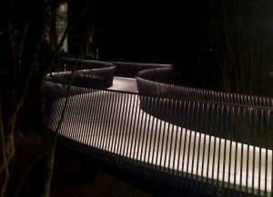
The height and proportions of the balustrade are deliberately reminiscent of the Hopetoun St bridge, which is a favourite of the engineers and the designers. The uprights create a shimmering moiré effect as pedestrians or cyclists move past, and the glossy surfaces reflect light, like a mirror. At night, the handrail will be underlit (like the Whittaker Place bridge that connects to Elim from Grafton Gully), casting a glow onto the surface of the bridge and giving a subtle sparkle to the baleen-like curtain of black steel.
The more questions I asked, the more detail poured forth. It’s clear this project has been utterly involving – not just because everyone has worked overtime on it, but also because the excitement is contagious. “Everyone saw from the start we had high aspirations for this,” says Dean. “Everyone took ownership of their part of the job, and went over and above what is typically required,” adds Andrew. “It simply wouldn’t be where it is now if this hadn’t been the case.”
And by “everyone”, we really mean everyone. Greg Dewe, the project manager for Hawkins, has been overseeing 220 people (and 55,000 person hours, including offsite manufacture and fabrication). “For us, the exciting part is building an iconic structure for Auckland,” he says. “This isn’t just a great big concrete structure. It’s aesthetically pleasing and it’s going to be there for a long time.”
The physical challenges of the installation were many. “The thing with cycleways is they’re always interesting projects because they’re often squeezed into land that hasn’t been doing anything else. The Canada St bridge snakes along the embankment and curves aroud existing buildings… it’s in a kind of no man’s land in the middle of Spaghetti Junction. You’ve got half a site on one side of SH1, and the rest on the other side… with residential and commercial areas on one side, and you’re flat out in the middle of the motorway on the other side.”
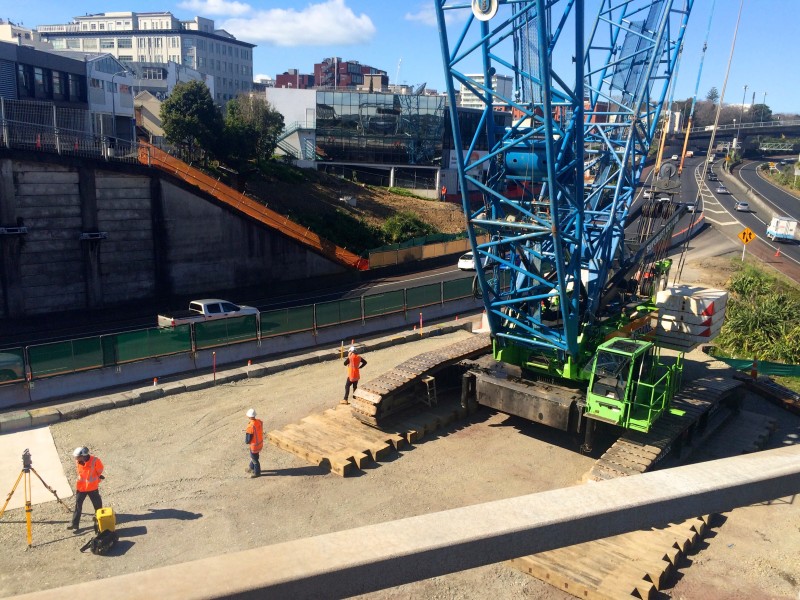
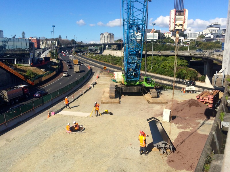
Simply accessing the site and getting materials in was a logistical challenge, with trucks having to pull into the workspace off the fast lane of the motorway. And the massive 250 tonne crawler crane required bringing in an extra 1200 tonnes of material to create the pad it would sit on. (That space will be re-landscaped once the build is finished).
Like the rest of the team, Greg and his crew have been working so relentlessly they’ve almost forgotten to stop and admire what they’ve created. “The pride in the project really comes at the end. It’s been such a fast track project… everybody has been working extremely hard. When we see that product in place and can drive past it or walk on it in the future, that’s where the real pat on the back goes.” Like many of us, Greg’s really looking forward to bringing his kids to enjoy the finished product.
Duncan, the Novare engineer, sums up the enormous scope of this project: “From the conception – Dean’s and our drawings – to PFS, who put the drawings into a computer that cuts the steel plate, then formed the curves of the bridge and fabricated it… and then the trucking of the enormous pieces, first to Pukekohe for painting – where the paint shop had to take out a wall to make it fit through the door! – and then onto the site, to be lifted into place by the crane which only just fits into the spot it’s sitting on… It was a wonderful human experience, with everyone taking pride in their part of it.”
Now all that’s left is the finishing touches – the last welds are being done on site as I type. Feels like just yesterday we were walking around a worksite, trying to visualise it. Less than two months from now… we ride! Can’t help watching that video again…

