Amazing things are happening right under our noses. Over in Waterview, for example, it’s pretty clear something big is under way: towering columns soar skywards like an auto-age Acropolis, and you can see people and machines hard at work along the causeway. But visible progress on the transformation of the old Nelson St offramp into a pedestrian and cycling skyway has been scant… until recently.
The first peeks of the Canada St bridge (which really does deserve a more exciting name) were exciting, and we can’t wait to watch it swing into place, starting tonight.
But as the uprights began appearing along the old off-ramp, the mood turned gloomy. “A disappointing outcome,” wrote Matt Lowrie on Transportblog, singling out the “massive 3m high barriers that will turn the off ramp into more of a trench.” Russell Brown dubbed it the “Sky Trench” (ouch) and lamented that “the cycleway in the sky will be closed in with three-metre high walls.”
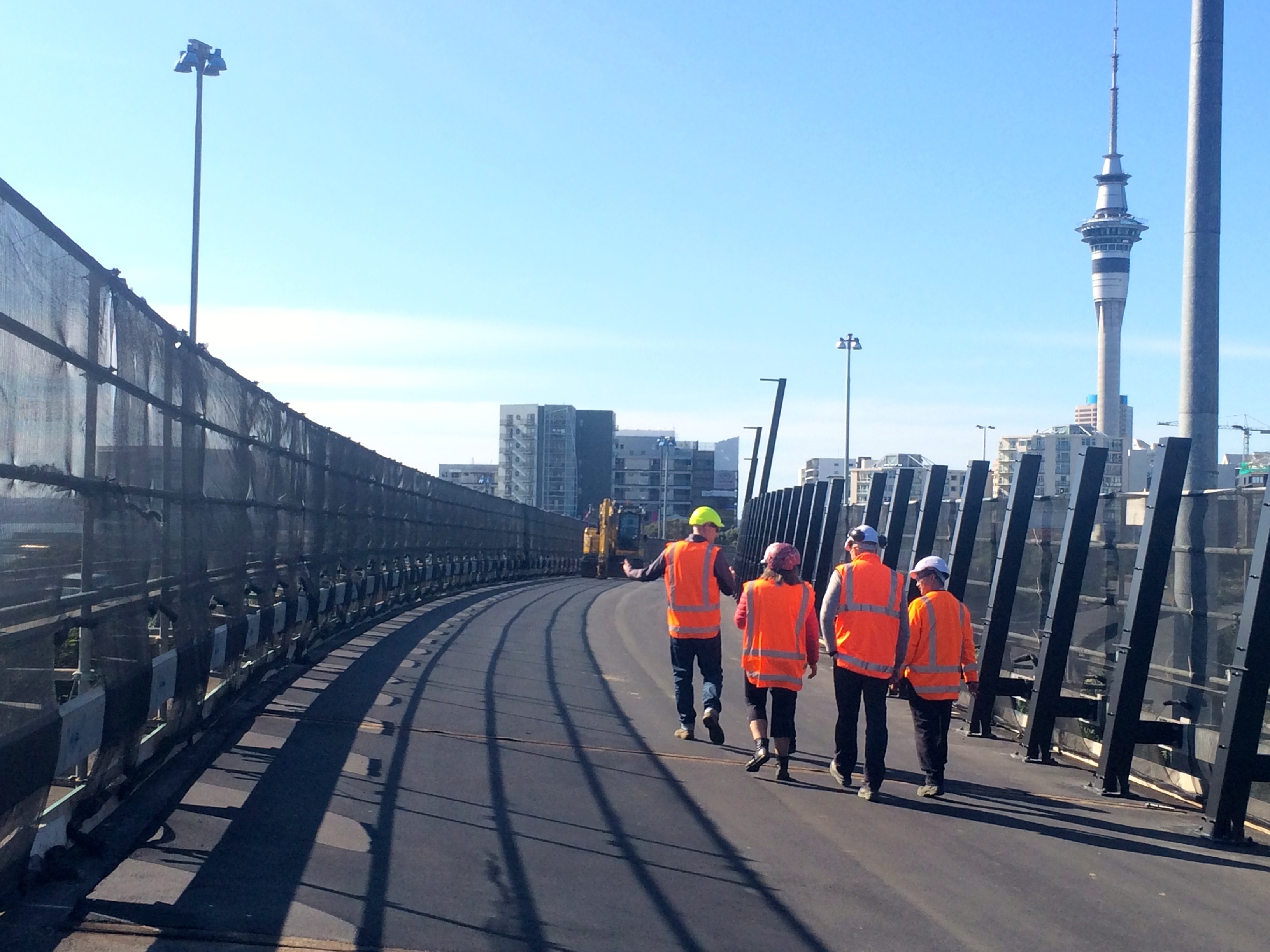
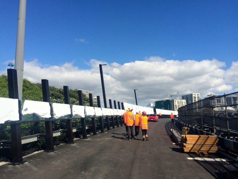
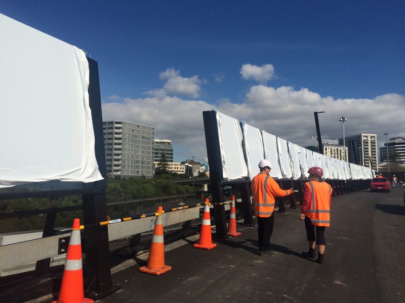
It’s true that, from certain angles, the black steel posts appear to blend together to form a solid wall. And the temporary scaffolding and protective fabric only enhances the closed-in effect.
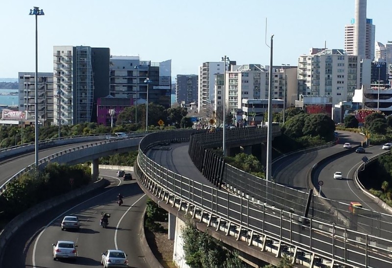
You can see why the urbanists among us might have been dismayed – what had been so very spectacular about the first exploratory walks on this “forgotten flyover” was the elevation, the intense sensation of vehicles whizzing past above and below, and the transgressive feeling of being, well, human in the midst of all that tarmac and traffic.
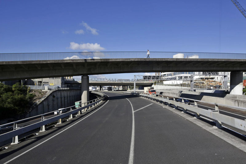
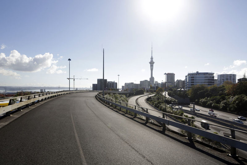
Not to mention, the view! Why, wondered concerned readers, would you take this slice of fresh-air industrial chic and fence it in? Why hide joyful pedestrians and cyclists away from the motorists racing past, like a human zoo? Was all of this going to be lost, tamed, walled in?
Mind you, we knew there’d be a framework of some sort, a structure to contain and define the space and keep people safe. Remember the early sketches, like this one (from back when the Day St bridge was still in contention as a possibility).
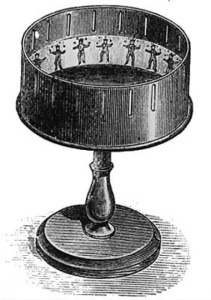 But I’ll admit – the preemptive disappointment from Russell and the Transportblog crew was contagious. Gazing down at the skeleton of the design being installed, I wondered if maybe the best we could hope for would be a cool zoetrope effect as you biked along, with glimpses of magnificent views flickering at the edge of your vision.
So when I tagged along on a site walk-through just over a week ago with members of the engineering team, I was keen to find something nice to say. Not just to cheer us all up, but also because given how hard a huge number of people are working to deliver the project, and how incredibly welcoming they were of our visit, it would have been a bit rude not to find something to love.
You know what was a bit rude?
Me thinking you could extrapolate a sensation from a snapshot. And all of us grumbling about the project being ‘over-engineered’, out of scale, waaaay too much steel.
Because you know what else they said that about?
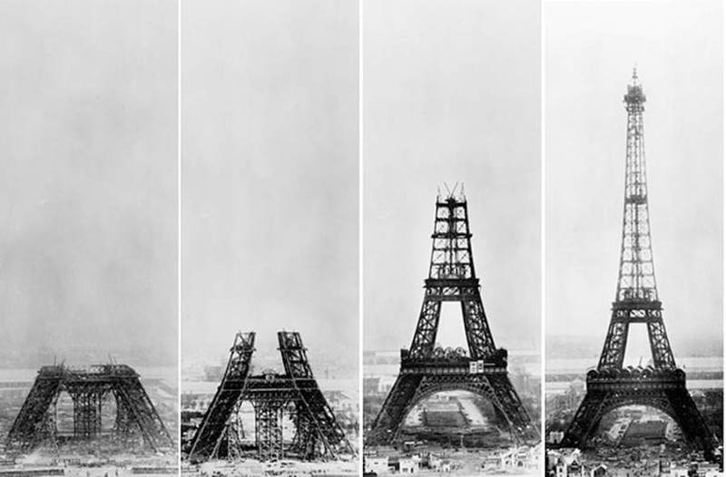
Wait. Am I saying that Nelson St is our Eiffel Tower, only horizontal? Well, obviously there are a few differences… notably the speed of the build.
Gustave Eiffel’s pop-up project for the World’s Fair was constructed in two years, two months and five days from go to whoah (a record at the time). Whereas Nelson St – just a twinkle in Max’s eye as recently as May 2014 – will be completed by the end of October 2015.
Here’s how fast it happened: in June 2014, Barb was writing cautiously: “It’s too early to say if the project is firstly, achievable, and secondly, deliverable within the agreed time frame. However, the goodwill and support from our partners, NZTA and AT, is very encouraging.” After NZTA was given a bit of a gee-up by Barb at the Grafton Gully opening, the engineering firm GHD got started on the design last October. A tender process that normally takes up to two years was completed in two months, and work began in earnest.
From conception to delivery in barely a year?! Unheard of! Success has many fathers, and necessity is the mother of you-know-what, and after a close-up view of what’s happening, I reckon we will all be delighted to lay claim to this baby.
Consider some of the constraints in creating this path for people right through the middle of New Zealand’s most car-centric concrete conglomeration:
- The need to connect it to an existing footpath and cycleway, at an incline that works for pedestrians and people on bikes (the original idea for a Bailey Bridge would have taken up most of the offramp just to descend from K Rd at a manageable slope)
- NZTA’s preference for keeping the offramp accessible as a functioning alternative for emergencies (this is why it won’t be transformed into an aerial garden like NYC’s High Line, although it will feature stunning paint and lighting effects – more about that in a future post).
- The prevailing wind and exposure to the elements.
- The fact the existing barriers are neither beautiful nor safe.
- And speaking of safety: in the middle of Spaghetti Junction, you have to contend with the proximity of vehicles at speed (19 lanes of traffic!), the height of the structure, and general human unpredictability.
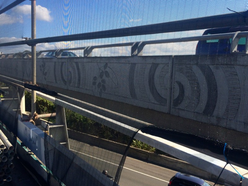
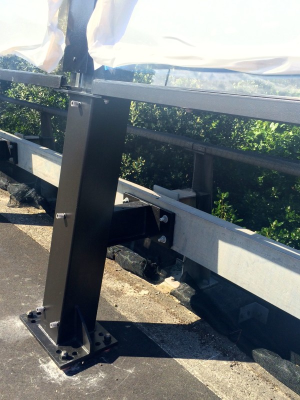
And, thinking from the ground up, you have to deal with all the minute variations in the surface itself. Built in the 1970s, the base structure isn’t exactly laser-straight in all its particulars. A millimetre here, a millimetre there adds up to a need to get this juuuuust right. Here’s how the new steel framework meets the pre-existing structure:
And there are over 300 of these uprights, each one individually manufactured to meet the various permutations of bridge surface and side.
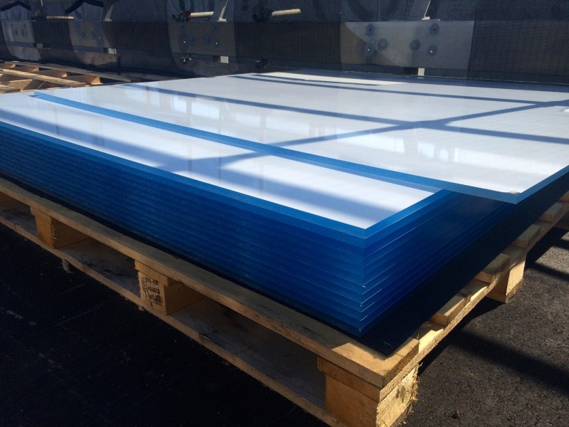
The uprights also need to hold the weight of the plexiglass panels, which are 15mm thick. And, because of the curvature of the bridge, the perspex panels need to be < 2.45 m wide… which is what dictates the spacing of the uprights. Maths!
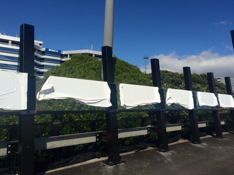
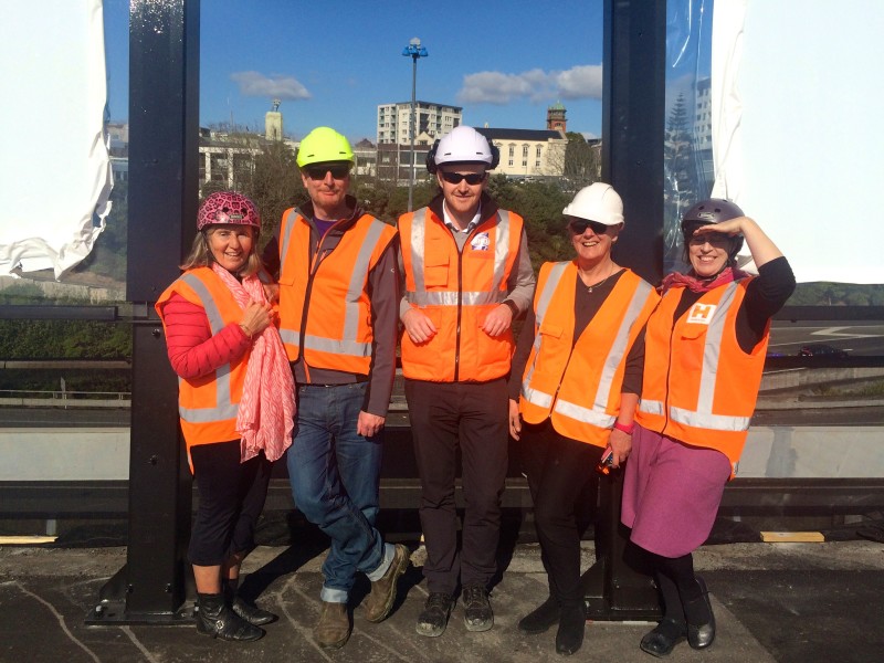
Sorting this part of the design was “a real head-scratcher” says Ronnie Salunga of NZTA; an original list of 36 possibilities was whittled down to six finalists before settling on the final version. The steel was sourced from Korea, Australia and New Zealand, and the parts manufactured in Whangarei.
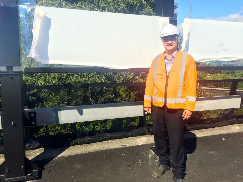
It’s an imposing framework for sure. But the uprights lean outwards by 8 degrees, to give a more open feeling. The shape echoes the “lotus-flower” profile of the Canada St bridge. Standing on the off-ramp, you feel both safely contained and yet available to the surroundings, as if in an open-weave basket.
I’d say anyone who has mildly acrophobic tendencies, wobbly ankles, or small children who like to pinball around public places will appreciate this balance of transparency with solid protection, especially given the camber on the road surface of up to 10%. (Seriously: for a moment out there on the work site, vertiginous and exposed, I felt like Mr Bean on the high-diving board. Only pride stopped me from flattening myself to the ground and refusing to move).
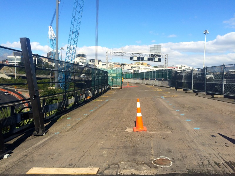
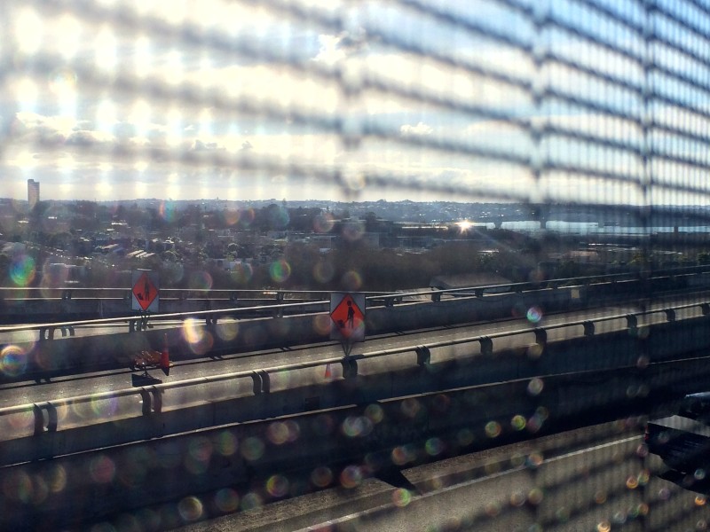
Not yet installed when we visited were the lower panels, which will be 1.4m high perforated black steel (rising to just above elbow height on an average adult). These have been designed to hide the existing side of the bridge and various ducting and cabling arrangements for the lighting (of which more in a later post). But they also have a 40% “open aspect” – in other words, the panel is 40% not there, like a net curtain – which will allow for fresh air, the hum of traffic, and sneak peeks for small visitors through the rounded oblong windows. Of course, kids will still demand to be hoisted up on shoulders for a better look – but with the plexiglass in place, this won’t be a terrifying prospect for anyone.
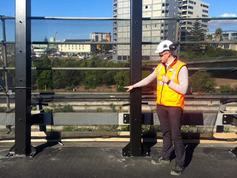
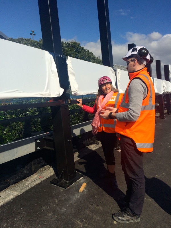
And above the perforated panels will be 1.6m of perspex – high enough to provide wind protection for even the tallest people on bikes, and most importantly, crystal clear views. The perspex, sourced from Germany, is not only self-cleaning, but can be buffed smooth and clear in the event of graffiti or scratches.
“Black steel is the unifying feature,” says Gansen Govender, who was Design Manager during the design phase and is the Engineer’s Representative during construction, “but you won’t be looking at it, you’ll be looking at the view.”
Indeed, very late in the design process, all of the lighting arrangements were shifted to the eastern (city) side of the bridge, so as to leave the western side – the one with the view – as unimpeded as possible.
This kind of flexibility on the fly is a signature of the project, and is something that everyone involved was eager to point out. As Gansen’s assistant Stephen Cummins told me later, over a cup of tea and copies of the plans: “This really is a unique project. Normally when you design something like this, you shut the door on the design and build the thing. But with this, everyone wants the best possible solution, so we’re constantly incorporating new features. It’s a real team effort.”
Who’s on that team? Well, NZTA is the client for whom GHD is designing and delivering the work along the off-ramp. Novare are in charge of designing and constructing the Canada St connecting bridge, with Hawkins in charge of construction, and architects Monk Mackenzie overseeing the overall design, with input from Auckland Council.

And every part of the team has been working to the absolute limit to deliver something truly spectacular. Gansen and Stephen looked a bit rueful when I asked them about the last time they had a holiday; they worked nights over Christmas, and they weren’t alone.
They’re adamant it will all be worth it. What was originally intended as a simple “A to B thoroughfare,” has become, says Gansen, “a feature in itself, and something transformative for everyone involved. This is the first time we’ve worked on a roading or infrastructure project with architects and urban designers and so on. There’s a lot of trust involved. But we have no vested interest in anything other than making sure the project is a success. We’re leaving something beautiful for the people of Auckland.”

Thanks to Ronnie Salunga and Leone Hansen of NZTA, and Gansen Govender and Stephen Cummins of GHD, for taking time out of their round-the-clock work to patiently show us round the work site and answer my questions. Stay tuned for more about the creation and installation of the Canada St bridge, and sneak peeks of the art & lighting design that will bring the space to life…

