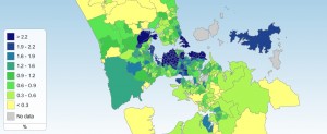
 More Census 2013 data has been revealed, and thanks to some nifty work of Auckland Council and Statistics New Zealand, there is a new tool available that gives you the data in graphical terms. This includes a shaded map showing where Aucklanders cycled to work on Census day.
[See map to right, or go onto the website, select the “Census area unit view” button at the bottom right, and then the “travel to work” tab at the top right]
Good news in there? Yes – overall, cycling did increase compared to 2006, by approximately a third! However, rising from ~0.9% to 1.2%, it remains low overall. Still, growth for the first time in ages, and some parts of Auckland look a LOT better. Some quick highlights we found:
- Cycling is busiest in the (western) central isthmus, with a lot of suburbs ranging in the 2-4% cycle mode share. Why would this be? More density? Older street network and settlement pattern (distance work-home) more friendly to cycling? More cycleways than in other parts of Auckland?
- The greatest cycling percentage however is in Whenuapai West (over 10%) – but the more typical “high mode share” suburb in Auckland would be a place like Pt Chevalier South (official census name, actually the area is better described as “Mt Albert North”) or Narrow Neck on the Shore, both with 4.5% cycle mode share.
- The low percentages of cycling among people living in the City Centre are curious at first glance. Maybe most people in those apartment buildings don’t have bike parking, and thus no bikes? Or, more likely, their ways to work are so short, that most walk instead (some of the Central City areas have walking rates over 50%)?
- Some of the flatter parts of Auckland, like the west and north of former Manukau City, are woeful. Especially compared with the sometimes quite hilly central suburbs that are doing a lot better, this puts a bit of a damper on the “it’s too hilly” argument. It’s not too hilly, it’s too hostile!
- Also quite visible are some of the more important cycle routes in Auckland (or at least, we think they are part of the reason for the higher cycling levels) – the suburbs along the Northwestern Cycleway, Tamaki Drive or Lake Road are all above-average – while places like the south-eastern central isthmus have much lower cycling levels (only road warriors try to cycle on Remuera Road or Great South Road…) – It might be worth spending some time to compare the amount of cycle facility length per area with cycle mode share and see if there is a clear correlation.
Of course this data is a snapshot of one single day, and covers trips to work only – and excludes, for example, people that rode their bike to the train (because only the train trip would be counted in the census assessment, which currently doesn’t allow trip chains). So like all such statistics, it should be seen in context, and used with some caution.
What it does provide however is a great way of showing WHERE people do cycle, which is a good proxy for where we are on the right track, and where Auckland is failing it’s (potential) cyclists. That will be very valuable when we discuss future investment in cycling.
[In more serious news, the robot takeover of the planet Earth (long predicted by documentaries like “The Terminator” and “The Matrix”) is rapidly gaining ground and cycling is next. I, for one, welcome our new robot overlords. They can’t do a worse job on transport funding than the past and present human overlords.]
Update: A nice and very responsive staffer at Auckland Council provided some extra breakdowns of the cycling numbers when we asked about averages:
Auckland Region:
Bicycle 2006: 1.01%
Bicycle 2013: 1.22%
Legacy (circa 2009) Auckland City Council Area:
Bicycle 2006: 1.55%
Bicycle 2013: 2.00%
Slow going, but going in the right direction… and as suspected above, the Inner Isthmus didn’t just have higher cycle numbers, it also grew faster. First tiny signs of a “virtuous cycle”?


